

Visualizing data is crucial for businesses to gain visibility and make informed decisions. In this article, we will explore the power of data visualization and how it can empower your business operations. By strategically visualizing data using modern accounting software and dashboards, you can save time, improve decision-making, and achieve true visibility into every aspect of your business.
Key Takeaways
|
Why Is Data Visualization Important?

Data visualization plays a critical role in empowering businesses to gain valuable insights and make informed decisions. By visually representing complex data sets, businesses can easily identify patterns, trends, and outliers, leading to better understanding and analysis through data visualization consulting services. With the ability to absorb information quickly, data visualization enables us to make faster decisions and improve our overall business insights. Moreover, data transformation tools can further advance this process by facilitating the manipulations and formatting of data to better accommodate the visualization techniques.
Data visualization also facilitates effective communication of data within organizations and with external stakeholders. It allows us to share information easily in a visually engaging format, making it more understandable and memorable.
Whether it’s presenting sales trends to stakeholders or showcasing healthcare data to medical professionals, data visualization enhances our ability to convey important information effectively.
“Data visualization is a powerful tool that enables us to see the unseen.” – John Smith, Data Analyst
Additionally, data visualization plays a significant role in the data presentation architecture (DPA) discipline. DPA focuses on optimizing the delivery of data, ensuring that it is presented in the most efficient and impactful way possible. By employing data visualization techniques, businesses can structure and organize data in a manner that enhances comprehension and facilitates decision-making.
The Benefits of Data Visualization
- Improved decision-making: Visualizing data provides clear insights, enabling us to make more informed decisions confidently.
- Enhanced business insights: By uncovering patterns and trends, data visualization helps us gain a deeper understanding of our business and industry.
- Effective communication: Visual representations of data make it easier to share information and convey complex concepts to stakeholders.
- Data presentation architecture: Data visualization optimizes the delivery and presentation of data, ensuring maximum impact and understanding.
We understand that the right data visualization tools are crucial for making complex information accessible and insightful. By leveraging powerful platforms such as ERP systems, professionals can transition smoothly into more specialized areas like Power BI. For those interested in advancing their skills, exploring online Power BI courses (suitable for beginners) can be an excellent place to start.
Overall, data visualization is a valuable tool that empowers businesses to harness the full potential of their data. You can also enhance data visualization using an AI PowerPoint maker to create beautiful and insightful slides. By visualizing complex information, we can unlock meaningful insights, improve decision-making, and effectively communicate our findings to others. In today’s data-driven world, data visualization is essential for driving business growth and success while also remaining competitive.
Types of Data Visualization Techniques

Data visualization techniques are powerful tools for businesses to effectively present and communicate complex information. By using different visualization techniques, businesses can transform raw data into compelling visual representations that are easy to understand and interpret. Here are some commonly used data visualization techniques:
- Line charts: Line charts are ideal for showing how variables change over time. They use lines to represent the data points, allowing for easy tracking of trends and patterns.
- Area charts: Area charts are useful for visualizing multiple values in a time series. They display the data as a series of areas that are stacked on top of each other, providing a clear picture of how the values contribute to the whole.
- Scatter plots: Scatter plots are effective for illustrating the relationship between two variables. They use dots to represent the data points, with each dot indicating the values of the two variables. Scatter plots help identify correlations or patterns in the data.
- Treemaps: Treemaps are excellent for showing hierarchical data in a nested format. They use rectangles to represent the data, with each rectangle representing a specific category or sub-category. The size of the rectangle represents the value or importance of the data.
- Population pyramids: Population pyramids depict the distribution of a population based on age and gender. They use two bar charts placed side by side, with one chart representing males and the other representing females. Population pyramids allow for easy comparison and analysis of demographic data.
These techniques are just a few examples of the many data visualization techniques available. Other techniques like infographics, bullet graphs, and heat maps also provide unique ways to present data in a visually appealing and understandable manner.
Visualizing Data with Line Charts

Line charts are one of the most commonly used data visualization techniques. They are effective for showing trends, patterns, and changes over time. Line charts use a series of data points connected by straight lines to represent the values of a variable or multiple variables. This allows for easy identification of how the values fluctuate over a specific period.
“Line charts are a great way to visualize the growth of our website traffic over the past year. It clearly shows the upward trend and helps us identify peak periods and areas for improvement.”
Line charts are particularly useful when analyzing stock prices, website traffic, sales data, and other time-dependent variables. They provide a visual representation of the data, making it easier to spot outliers, identify patterns, and draw insights. While creating line charts may be tedious and seem like a waste of time, you can streamline the process by automating the creation of line charts with ERP system integration.
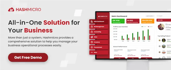
You may be unfamiliar with ERP system, its functions, and more importantly, its pricing scheme. Well, there’s no need to worry as you can click this image below and understand more about the ERP system’s pricing scheme along with how you can reduce investment cost through EDG (Enterprise Development Grant) which you can gain up to 50%.


Benefits of Data Visualization in Different Industries

Data visualization is a valuable tool that has numerous use cases across various industries. Let’s explore how different sectors leverage data visualization to gain insights and drive success in their operations.
Sales and Marketing
In the realm of sales and marketing, data visualization plays a crucial role in tracking web traffic trends and evaluating the effectiveness of marketing campaigns. With visually appealing charts and graphs, businesses can easily identify patterns and make data-driven decisions to optimize their marketing strategies.
By visualizing customer behavior and campaign performance, sales and marketing teams can fine-tune their efforts to maximize results and drive revenue growth.
Retail and Wholesale
Data visualization is a transformative asset for both the retail and wholesale sectors, offering substantial advantages across various domains. In retail, it facilitates a comprehensive understanding of customer behavior and preferences, enabling precise inventory management, targeted marketing, and improved customer experiences. By automate data entry, businesses can ensure the accuracy and reliability of the data used for visualization.
Meanwhile in the wholesale industry, data visualization enhances supply chain efficiency, allowing real-time adjustments and informed decision-making. By visualizing inventory levels, order fulfillment, and market trends, businesses in both sectors can make agile, informed decisions, ensuring competitiveness and sustained growth in dynamic markets.
Healthcare
In the healthcare sector, data visualization is used to visualize and analyze important health data. By presenting complex medical information in an easily understandable format, healthcare professionals can identify trends, patterns, and correlations. This enables them to make informed decisions, improve patient outcomes, and develop targeted interventions.
Data visualization also helps healthcare organizations monitor and track the spread of diseases, enabling proactive responses to public health emergencies.
Scientists, Finance, Logistics, Data Scientists, and Researchers
Data visualization is widely utilized by scientists, finance professionals, logistics experts, data scientists, and researchers to gain insights from large and complex datasets. By presenting data visually, these professionals can identify trends, outliers, and relationships that may not be apparent in raw data.
This enables them to make informed decisions, develop strategies, and communicate their findings effectively to colleagues and stakeholders.
The Science of Data Visualization

Data visualization is not just about creating visually appealing charts and graphs; it is a science that leverages our understanding of how humans process information. Researchers have identified two distinct methods of information processing: System 1 processing and System 2 processing.
System 1 processing is fast, automatic, and unconscious. It allows us to quickly absorb information without much cognitive effort. On the other hand, System 2 processing is slow, logical, and conscious. It involves deeper analysis and reasoning.
When it comes to data visualization, it is essential to engage both System 1 and System 2 processing to effectively communicate insights. Through visual representations, we tap into the power of System 1 processing, allowing viewers to absorb information quickly and effortlessly. By presenting data in an aesthetically pleasing and intuitive manner, we help users make sense of complex information without conscious effort.
The Power of Visual Storytelling
Data visualization goes beyond presenting numbers; it tells a story. By carefully selecting the right visual elements and design principles, we can guide users through the data and highlight key insights. As Edward Tufte, an expert in data visualization, once said, “Good design is clear thinking made visible.”
Visual storytelling engages both the analytical and emotional aspects of the human brain, making data more memorable and impactful. It enables us to make data-driven decisions with confidence, uncover hidden patterns, and discover new opportunities for growth.
The Future of Data Visualization
As technology advances, the science of data visualization will continue to evolve. Machine learning and artificial intelligence will play an increasingly important role in automating data analysis and generating dynamic visualizations tailored to individual preferences. Interactive features, such as data exploration and filtering, will empower users to delve deeper into the insights hidden within their data.
Furthermore, the science of data visualization will continue to bridge the gap between data and decision-making. By presenting complex information in a visually appealing and accessible way, we can empower businesses to harness the full potential of their data and drive meaningful change.
Data Visualization Tool and Vendor: HashMicro’s Hash Core ERP

Data visualization is an essential aspect of business intelligence, enabling organizations to transform complex data into compelling visual representations. To achieve effective data visualization, businesses rely on a range of powerful tools offered by various vendors in the market, one of them being ERP (Enterprise Resource Planning) system.
These ERP tools provide businesses with the capability to create automatic dashboards, interactive charts, and visually appealing reports that facilitate better decision-making and analysis. One of the most popular and recommended tools in Singapore is HashMicro’s Hash Core ERP.
This particular tool offers a comprehensive suite of features to help businesses analyze, understand, and communicate their data effectively. With Hash Core ERP, users can create interactive visualizations that allow for deeper exploration of data, uncovering valuable insights. The platform also provides advanced analytics capabilities, making it a valuable asset for organizations looking to harness the power of data visualization.
Moreover, with an intuitive user-friendly interface and seamless integration with other HashMicro’s modules like accounting and more, Hash Core ERP enables businesses to create interactive reports and dashboards that can be easily shared and accessed across the organization. The platform offers a range of data connectors, allowing users to connect to various data sources and create dynamic visualizations.
Overall, users can easily navigate through data, drill down into specific details, and gain valuable insights into their business operations with HashMicro’s Hash Core ERP. The platform also offers robust security features, ensuring the confidentiality and integrity of data.
Key Features of Hash Core ERP:
- Automatic dashboards: This tool provides the functionality to automatically generate dashboards that display key performance indicators (KPIs) and real-time data updates.
- Interactive capabilities: Users can interact with the visualizations, enabling them to explore different data dimensions, filter information, and gain a deeper understanding of their data.
- Business intelligence integration: This tool is designed to also seamlessly integrate with business intelligence platforms, allowing for comprehensive data analysis and reporting.
By leveraging the power of data visualization tools and partnering with reputable vendors like HashMicro, businesses can unlock the full potential of their data, improve decision-making, and gain a competitive edge in today’s data-driven landscape. Visualizing data, especially with an ERP system, will definitely enable business growth. Before deciding to invest in this popular advanced ERP software, you can try out its demo for free!
Empower Business Operations with Strategic Data Visualization through ERP System
In today’s data-driven world, the ability to effectively visualize data is crucial for businesses to thrive and empower their operations. Strategic visualization of data using modern software like ERP with its dashboards allows us to gain valuable insights, make informed decisions, and achieve true visibility into every aspect of our business. More information about the ERP software system can be found just by clicking the image below.

By harnessing the power of data visualization, we can save time and streamline our decision-making processes. Visual representations of key performance indicators and trends enable us to quickly identify areas of improvement and capitalize on opportunities. This strategic approach to data visualization empowers us to drive business success and stay ahead in the fast-paced digital landscape.
As we continue to embrace the digital age, it is essential to leverage the right data visualization techniques and tools to maximize our business outcomes. By adopting a proactive approach to strategic visualization, especially by adopting an ERP solution such as HashMicro’s Hash Core ERP, we can empower our operations, make smarter decisions, and ultimately achieve business empowerment in today’s data-driven world.
Frequently Asked Questions About Data Visualization
-
What is data visualization?
Data visualization is the process of representing data in a visual format, such as charts, graphs, and tables, to make it easier to understand and analyze.
-
How does data visualization leverage the way humans process information?
Data visualization leverages the fast, automatic processing of System 1 and the slow, logical processing of System 2 to present information in a way that is easily absorbed and understood.
-
What are some popular data visualization tools?
Examples of some popular data visualization tools include HashMicro’s Hash Core ERP, Tableau, Power BI, and QlikView, which offer interactive dashboards and capabilities for analyzing and presenting data.
-
How can data visualization empower businesses?
By strategically visualizing data using modern accounting software and dashboards, businesses can save time, improve decision-making, and gain true visibility into every aspect of their operations.