An analytics dashboard is a visual interface that helps businesses monitor key metrics and performance data in real time. By turning raw data into charts and summaries, it simplifies decision-making across departments like sales, finance, and operations.
Analytic dashboards remain one of the most strategic tools in business intelligence, with over 60% of companies viewing them as critical to their BI strategy, according to the 2023 report.
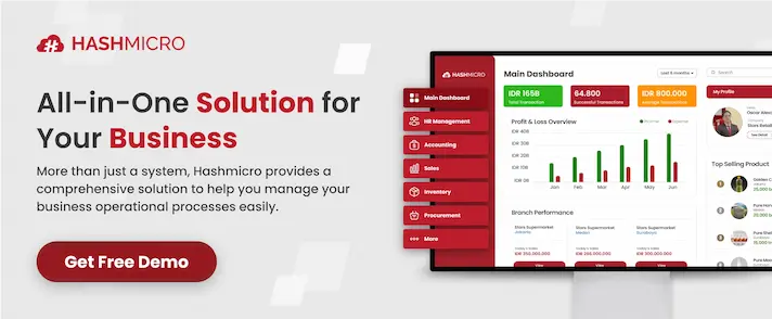
To support this need, integrated platforms like HashMicro ERP provide built-in analytics dashboards that help users monitor KPIs, financial performance, inventory movement, and more directly within one system.
In this article, we’ll explore what an analytics dashboard is, the key types available, and how it supports better business outcomes.
Key Takeaways
|
What is an Analytics Dashboard?
An analytics dashboard is a visual tool that displays key metrics and data summaries. It helps users monitor performance and make informed decisions by presenting real-time data in a clear, interactive format.
Unlike traditional static reports, analytics dashboards are dynamic and interactive. Users can filter data, drill down into specific details, and customize the layout to suit different needs or departments.
These dashboards often integrate data from various sources such as sales systems, finance platforms, marketing tools, and operational databases into one unified view.
For instance, a marketing team might use a dashboard to monitor campaign performance, web traffic, and conversion rates, while a finance team may focus on cash flow, expenses, and budget tracking.
By presenting complex data visually, dashboards make it easier to spot trends, detect anomalies, and act quickly.
10 Examples of Analytics Dashboard
Here are 10 types of analytics dashboards businesses commonly use, along with what they track and how they drive better decisions:
Below are ten analytics dashboard examples, each tailored to specific business needs and teams:
1. Product analytics dashboard
Track user engagement, feature adoption, retention, and churn. This dashboard helps product teams understand how users interact with specific features, which ones drive value, and where friction exists. It’s essential for prioritizing product improvements based on real usage data.
2. Marketing performance dashboard
Monitor campaign performance, website traffic, conversion rates, and lead sources. Marketers use it to evaluate which campaigns deliver the best ROI, understand audience behavior, and adjust budget allocation accordingly across channels like SEO, email, and paid ads.
3. Sales pipeline dashboard
Visualize current deals, stage progress, close rates, and forecast accuracy. It gives sales managers visibility into pipeline health, helps identify bottlenecks, and enables teams to focus on high-potential leads that are more likely to convert.
4. Customer success dashboard
Show customer health scores, NPS, renewal status, and support interactions. With this dashboard, customer success teams can proactively identify at-risk accounts, track onboarding progress, and take action to improve long-term customer satisfaction and retention.
5. Financial performance dashboard
Display revenue, expenses, profit margins, and cash flow trends. Finance teams use it to monitor the financial stability of the business, detect cost inefficiencies, and ensure budgets are aligned with strategic goals.
6. Executive overview dashboard
Combine high-level KPIs across departments such as sales, marketing, finance, operations, and HR. Executives rely on this dashboard for a snapshot of overall company performance, helping them align initiatives and make faster, more informed decisions.
7. User behaviour dashboard
Analyze user flow, session duration, click paths, and drop-off points. Product and UX teams use it to uncover how users navigate the platform, what actions lead to conversions, and where improvements are needed to boost engagement.
8. Operations and logistics dashboard
Track inventory levels, fulfillment rates, supplier performance, and delivery times. Operations teams use this dashboard to maintain efficiency in supply chains, reduce delays, and ensure customer orders are delivered accurately and on time.
9. Project tracking dashboard
Show project status, task completion, resource usage, and deadlines. Ideal for project managers who need to monitor progress, manage workloads, and prevent bottlenecks, especially in cross-functional or agile teams.
10. E-commerce performance dashboard
Display online sales, cart abandonment rates, average order value (AOV), and top-selling products. This dashboard helps e-commerce businesses optimize conversion funnels, personalize offers, and increase revenue based on customer shopping behavior.
Key Benefits of Analytics Dashboard

Analytics dashboards empower businesses to make smarter, faster decisions by turning raw data into meaningful insights. Here are four key benefits:
1. Real-time visibility
Dashboards provide up-to-the-minute data on key performance indicators, allowing teams to monitor business activities as they happen. This helps detect issues early, such as a sudden drop in sales or rising customer complaints, so they can be addressed before escalating.
2. Improved decision-making
With data from various sources consolidated in one place, decision-makers no longer need to rely on fragmented reports or intuition. Dashboards offer a clear picture of what’s working and what isn’t, supporting timely and informed strategic choices across departments.
3. Greater efficiency
Instead of manually pulling reports or analyzing spreadsheets, teams get automatic visual summaries of important metrics. This not only saves time but also reduces errors, allowing staff to focus more on actions and results rather than data collection.
4. Enhanced accountability
When goals, progress, and KPIs are clearly displayed, team members can easily see where they stand. This level of transparency encourages ownership, improves alignment, and drives teams to stay focused on shared objectives.
How to Create a Data Analytics Dashboard
A great marketing analytics dashboard is built with clarity, purpose, and usability in mind. Follow these five key steps to create one that delivers real value:
1. Define the objective and users
Start by identifying the main purpose of the dashboard and who will use it. A dashboard for a sales team will focus on different data than one meant for executives. Clear goals help keep the content relevant and targeted.
2. Select key metrics (KPIs)
Choose only the most important metrics that align with your objective. Too many data points can clutter the dashboard. Focus on actionable KPIs like conversion rates, customer retention, or monthly revenue.
3. Connect data sources
Integrate data from your most reliable platforms CRM, ERP, marketing tools, or internal databases. Automation ensures the dashboard always displays current information without manual updates.
4. Design with clarity
Use the right visual elements (charts, graphs, tables) to represent your data clearly. Group related data, use consistent color schemes, and avoid overcrowded layouts to make insights easy to spot at a glance.
5. Test, launch, and improve
Share the dashboard with a small group of users first to gather feedback. Once live, monitor its effectiveness and refine the layout or data as business needs evolve. A good dashboard should grow along with your company.
How to Overcome Challenges Presented in Analytics Dashboard
Even the most well-designed dashboards can face challenges that limit their effectiveness. Here’s how to address the most common ones:
1. Information overload
Including too many charts, metrics, or filters can overwhelm users and dilute the dashboard’s core message. A cluttered interface makes it harder to focus on key performance indicators that truly matter.
2. Data accuracy and consistency
When data is outdated, duplicated, or inconsistent across sources, it leads to confusion and mistrust. Decision-makers may hesitate to rely on insights if the information doesn’t align. Ensuring clean, reliable, and regularly updated data is essential for dashboard outputs.
3. Poor usability and design
A visually crowded or unintuitive dashboard, even if it contains useful data, can discourage users from using it. If users struggle to interpret the visuals or navigate the layout, the insights lose value.
4. Lack of role-based relevance
A one-size-fits-all dashboard often doesn’t meet the needs of different teams. Executives may prefer summaries, while others need detailed views. Customizing dashboards by role ensures each user sees data that supports their decisions.
5. No clear actionable Insights
Dashboards that only show raw data without context may leave users unsure of what steps to take next. Highlighting key trends, deviations, and progress toward goals helps users interpret the data quickly and take meaningful action.
Conclusion
An analytics dashboard is a powerful tool that transforms raw data into clear, actionable insights through visualizations. It plays a crucial role in helping businesses monitor performance, make informed decisions, and stay aligned with their strategic goals.
Having access to accurate and real-time information is not a luxury it’s a necessity. That’s why choosing the right platform to manage and visualize your data is just as important as the data itself.
HashMicro ERP offers an integrated data analytics dashboard that brings together data from various departments into one centralized view. With customizable metrics and real-time updates, it empowers decision-makers to act fast and stay ahead.
Ready to make smarter, faster decisions? Get a free demo of HashMicro ERP today and see how a well-designed analytics dashboard can elevate your business.

FAQ About Analytics Dashboard
-
Is a dashboard a data model?
A data model defines how data is structured, stored, and retrieved to support analysis—enabling the creation of reports, dashboards, and embedding insights into applications.
-
What are the types of data analytics dashboards?
Data analytics dashboards are generally categorized into three types: operational, strategic, and analytical. Operational dashboards track real-time workflows and display the current status of day-to-day activities.
-
What do KPI dashboards focus on?
KPI Dashboards are characterized by their ability to display live data, update automatically, and offer interactivity, such as drilling down into specific data points and filtering information. Dashboards are visually focused, using charts, graphs, and gauges to make complex data easy to understand quickly.