Typography is a term that is often used in the world of graphic design. But not only graphic design, literature, or fine arts also usually use this technique in making a work. This is a technique of selecting and arranging letters beautifully so that the viewer feels comfortable. In doing so, it requires skill and good mastery of technique. This technique has developed from the first phase to the other phases. You can use sales software to increase your business sales.
What is Typography?
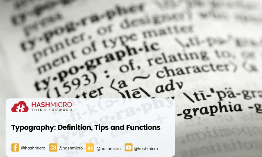
CareerFoundry stated that typography is an art technique in arranging letters and text in the available space so that they can create attractive visuals so that they become comfortable for people to see and read. To apply this technique, you need to have a good font, appearance, and structure. It aims to get a certain emotion so that it can convey a message to the reader. In short, typography is a technique that can bring the text to life to make it more interesting.
In the current digital era, this technique has become an obligation that a graphic designer must have. Because of the many fonts and font generators available, graphic designers must be able to choose the one that fits the design they create. You can also use Sales Software to increase your business sales.
Also Read: Why is Content Marketing Important for Business
Typographic Elements
There are twenty-two typographic elements, namely:
- The leg is the part of the letter that extends upward, either straight or curved, with one end attached and one free, like the bottom of the letter “K”.
- An arm is the part of a letter that extends upward, either straight or curved, with one end attached and one free, such as an uppercase or lowercase version of the letter “V.”
- Terminal, referring to the end of a line in a letter that doesn’t have a serif, is commonly seen in many sans-serif fonts.
- Ascenders, are the part of a lowercase letter that extends above x-height, such as the letter “h”, “f”, or “l”.
- Baror bars are horizontal strokes of a letter, as in “f” or “e”.
- The bowl, is the curved part of the character that creates a closed space such as the “O” and “o,” and the “D” and “d”.
- stem, the main vertical stroke of a letter such as “K”, or the first diagonal stroke of a non-vertical letter such as “A”.
- Cap height, which is an imaginary line that marks the height of a flat, capital letter like “M”.
- Counter, negative space partially or completely enclosed in certain letters.
- Crossbar, is a horizontal stroke of a letter connecting two other strokes, such as with an “A” or an “H”.
- X-height refers to the distance between the baseline and the median line for lowercase text.
- Descenders, the part of the letter that falls below the baseline as seen in the letters “Q,” “y,” “j,” and “g.”
- serif, which is a small line or stroke that hangs over the main stroke as a style accent in a serif font.
- Spur, i.e. small projections protruding from the main stroke, often seen on the horizontal line of an uppercase “G”.
- Ear or ears are small strokes protruding from the side of the lowercase “g”.
- Finals, the curved or tapered end is seen in letters like “e” and “c”.
- stroke, a straight or curved line used to create a visual representation of a letter.
- The shoulder is the downward curvature or curvature seen in letters such as “h”, “m”, and “n”.
- Spine, which is the main curved line in “S” and “s”.
- Tail or tail refers to the curved descending part of a letter such as “Q,” “j,” “y,” and “g”.
- title or the dot above the lowercase “i” or “j”.
Typography Functions
Attract readers
In addition to designing images, a graphic designer must also be able to attract readers. How to attract these readers? That is by using typography. With this, a graphic design can attract the attention of readers through fonts and placement of writing and also good visuals. Like when you’re surfing on social media, you’ll definitely stop longer when you see a design or post that catches your eye, be it a good design or an attractive font. Indirectly, this can increase brand awareness.
In addition, you can also use the HRM System from HashMicro to manage HR tasks and employee administration automatically.
Provide value for the brand
Typography is important because it can add value to a brand. Each font has its own uniqueness and strength in describing a business or brand. You can use a font that is simple and easy for many people to read to make it more attractive. In addition, you can also adjust the use of modern or ancient fonts as needed as long as the font is still easy to read.
Make it easy for readers
In addition to attracting attention, typography is also important in making it easier for users to read the existing text. If you choose the wrong font, readers will find it difficult so they are not interested in reading further. Therefore, you should use a font that is easy for users to read.
Tips for Using Typography
In using this technique, you can consider the font first before using it. Then, you also need to think about the proper placement of these texts in a design. In addition, you also need to choose the right color to make it more attractive. The color must also be in harmony with the font so that it is comfortable for the reader to see. After selecting the color and font, you need to adjust the spacing and alignment. It also aims to make the reader feel comfortable. Not only that, you also need to provide space around the design and alignment so that the design structure is not destroyed. A writing assistant can help streamline these decisions and ensure the overall visual coherence of the design.
Also Read: Microblogs as Content for The Latest Marketing MethodsConclusion
Typography is an important and useful technique in today’s digital era. With this technique, you can provide value to a brand. This means you can market your brand well if you can use this technique well too. In addition, this technique is also useful so that the reader becomes comfortable when reading or viewing a design. Selection of fonts, and colors, and setting the spacing and alignment is the key to using this technique.
In addition, you can also use the ERP Software in assisting your business operations. ERP software systems can perform various aspects of business automatically. This system is also suitable for various types of companies or businesses. With this system, you can make more accurate decisions with the support of the most advanced business management software. Schedule a free demo now to quickly apply this system to your company.


